Introduction to Layouts
Layout Components
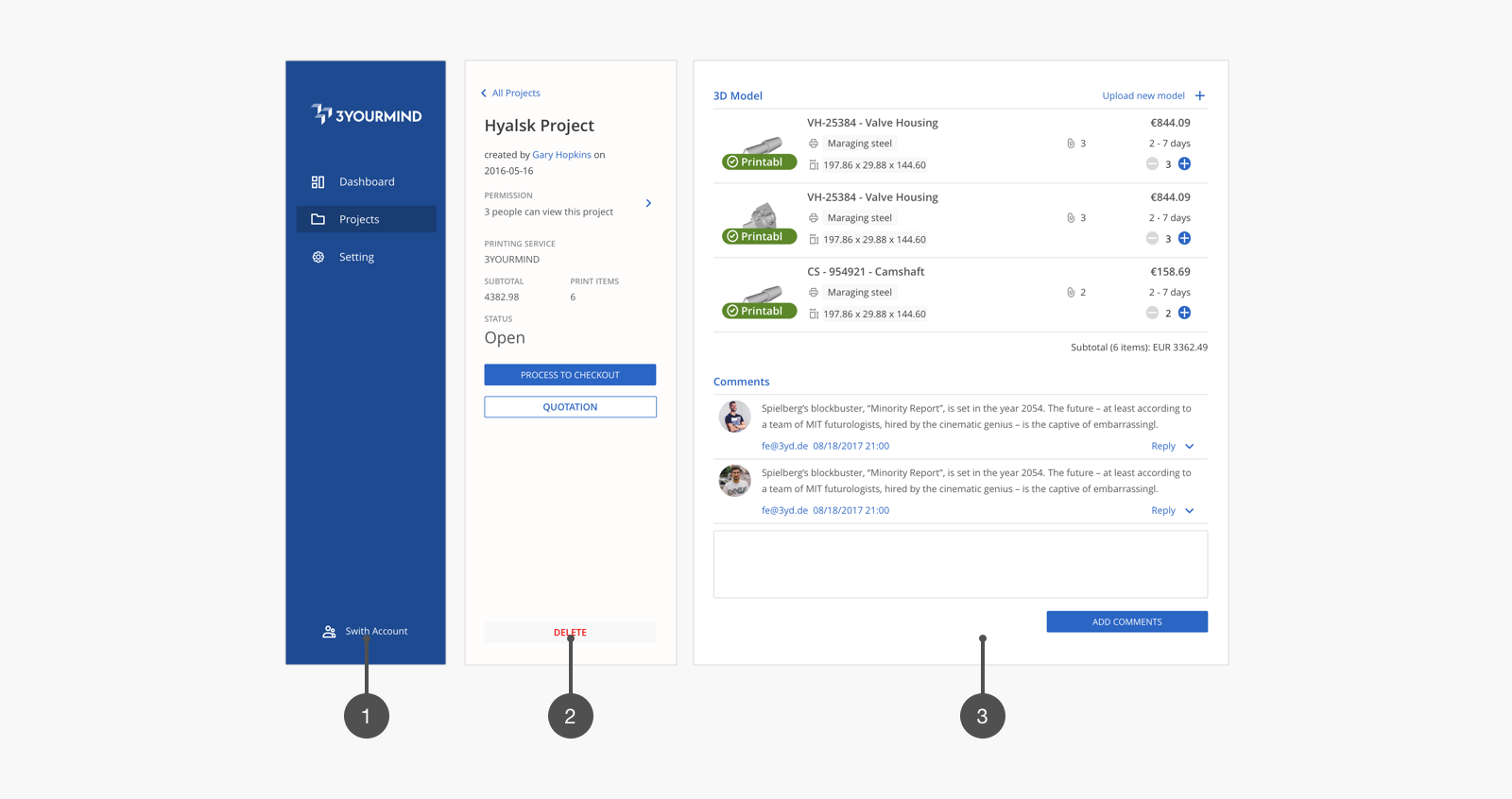
Navbar
The Navbar is the top-level navigation for the user. The width is fixed: 280px or 14rem. The background is Primary-600 (#2659AB).
Actionbar
The actionbar is always located between the Navbar and Workspace, which can be omitted if necessary.
The actionbar is considered to be an attachment to the Workspace.
It represents addtional and important information for the Workspace.
The width of Actionbar is also fixed: 320px or 16rem. The background color is #F8F8F8.
The elements suggested on the Actionbar are: primary action button,
Secondary action buttton, information which doesn't require complex interaction,
and sub-menu for the Workspace.
Workspace
The workspace is designed as a space for related tasks, most interactions
should be inside this area. The width of the Workspace is responsive: 100% of the screen width with margin 24px to the right.
The background is #FFFFFF, with dropshadow: 1px 0 1px #DBDBDB;
Responsive Classes
Kotti uses the same responsive classes as Spectre. You can find them here.