Reason: Will be replaced by the new implementation of KtTable with Kotti@9.0.0
Alternatives:
KtTableKtStandardTable KtTableKtStandardTable 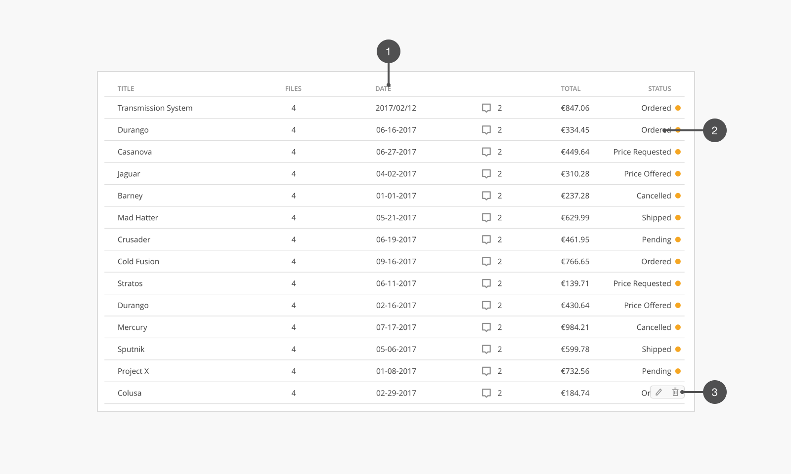
label text. The heading should express the content of each column.default text style.In order to use the table, you need give rows and columns data to KtTableLegacy component.
columns define the column of the table, label is the header text of table, key will be used to find the value from rows.
Update: The use of key is deprecated use prop instead of key when defining columns
rows is an Array of Objects that represent a row.
For better performance in complex operations, define a rowKey to index each row with.
<KtTableLegacy :rows="rows" :columns="columns" />
{
	columns: [
		{ label: 'Name',    prop: 'name' },
		{ label: 'Date',    prop: 'date' },
		{ label: 'Address', prop: 'address.line' },
	],
	rows: [
		{ date: '2016-05-03', name: 'Tom',     address: { number: 119, line: 'No. 119, Grove St, Los Angeles' } },
		{ date: '2016-05-02', name: 'Jackson', address: { number: 89, line: 'No. 89, Grove St, Los Angeles' } },
		{ date: '2016-05-04', name: 'Fen',     address: { number: 182, line: 'No. 182, Grove St, Los Angeles' } },
		{ date: '2016-05-01', name: 'Fexiang', address: { number: 189, line: 'No. 189, Grove St, Los Angeles' } },
	],
}
The columns property can be written as nested children of the table components using <KtTableLegacyColumn />.
All props that a column takes, the KtTableLegacyColumn component takes, as well, with the exception of key
prop is required
<KtTableLegacy :rows="rows">
	<KtTableLegacyColumn label="Name" prop="name" />
	<KtTableLegacyColumn label="Address" prop="address.line" />
</KtTableLegacy>
{
	rows: [
		{ date: '2016-05-03', name: 'Tom',     address: { number: 119, line: 'No. 119, Grove St, Los Angeles' } },
		{ date: '2016-05-02', name: 'Jackson', address: { number: 89, line: 'No. 89, Grove St, Los Angeles' } },
		{ date: '2016-05-04', name: 'Fen',     address: { number: 182, line: 'No. 182, Grove St, Los Angeles' } },
		{ date: '2016-05-01', name: 'Fexiang', address: { number: 189, line: 'No. 189, Grove St, Los Angeles' } },
	],
}
In most cases the table is the same width as its parent. You can also specify the column width in columns.
{
	columns: [
		{ prop: 'name',    label: 'Name',    width: '30%' },
		{ prop: 'date',    label: 'Date',    width: '20%' },
		{ prop: 'address.line', label: 'Address', width: '50%' },
	],
}
Alignment would default to be left. It can be customized for common cases that require it, such as price, and currency.
align in columns decides the alignment of each column’s text.
{
	columns: [
		{ prop: 'name',    label: 'Name',    align: 'left' },
		{ prop: 'date',    label: 'Date',    align: 'center' },
		{ prop: 'address.line',    label: 'Address',    align: 'right' },
	],
}
When content should not be hidden, using horizontal scrolling is a better alternative.
isScrollable will enable horizontal scrolling for the table.
<KtTableLegacy :rows="rows" :columns="columns" isScrollable />
isSelectable enables mutilple-select option of the rows.
Note: The use of v-model is REMOVED. Instead, bind the Array of selected to the selected property, and subscribe to @selectionChange, which returns the currently selected rows whenever they change
Note the difference between the Array model passed to the v-model (now, removed) and that passed to the selected property.
The former is anArrayof selected indices, and the latter is anArrayof rowObjects
Selected Rows: [
  {
    "address": {
      "line": "No. 119, Grove St, Los Angeles",
      "number": 119
    },
    "date": "2016-05-03",
    "name": "Tom"
  }
]
Note that the use of a
JSON.stringify()in a<pre></pre>tag is for readability purposes
<div>
	<KtTableLegacy
		:rows="rows"
		:columns="columns"
		isSelectable
		:selected="selected"
		@selectionChange="((selection) => selected = selection)"
	/>
	<pre>Selected Rows: {{JSON.stringify(selected,undefined, 2)}} </pre>
</div>
{
	data(){
		return {
			selected: [
				{
					date: '2016-05-03',
					name: 'Tom',
					address: { number: 119, line: 'No. 119, Grove St, Los Angeles' },
				}
			],
		}
	}
}
disableRow function can be passed to KtTableLegacy to reactively disable rows, based on your view and specific row data.
<KtFieldText v-model="disableName" />
<KtTableLegacy
	:rows="rows"
	:columns="columns"
	:disableRow="disableRow"
	isSelectable
/>
{
	data() {
		return {
			disableName: 'F'
		}
	},
	methods: {
		disableRow({ row }) {
			/**
					When row.name is just an empty string, it will match everything,
					thus, disable all
			 */
			return row.name.includes(this.disableName)
		}
	}
}
KtTableLegacy has a @rowClick event for when a user clicks on a row.
Note: @activateRow is, however, the preferred alternative, because the latter gets triggered
on row click, or when the user hits the "enter/return" key while row's focused, while the former gets triggered only with clicks.
Payload from @activateRow is (row, rowIndex)
Note: Neither events get triggered on a disabled row.
<KtFieldText v-model="disableName" />
<KtTableLegacy
	:rows="rows"
	:columns="columns"
	:disableRow="disableRow"
	@activateRow="showAlertOnClickOrEnter"
/>
methods: {
	showAlertOnClickOrEnter(row, rowIndex) {
		info({text: `${JSON.stringify(value)} is at index: ${model}!`})
	}
}
You can order Columns, by dragging, if you use the useColumnDragToOrder flag
<KtTableLegacy :rows="rows" useColumnDragToOrder>
	<KtTableLegacyColumn label="Avatar" prop="name" :renderCell="renderCell" />
	<KtTableLegacyColumn label="Date" prop="date" :formatter="formatDate" />
	<KtTableLegacyColumn label="Address" prop="address.line" />
</KtTableLegacy>
To enable sorting, you must do BOTH the following:
useQuickSortControlsortable to any column definition (the ones to enable sorting for).<KtTableLegacy :rows="rows" useQuickSortControl>
<KtTableLegacyColumn label="Name" prop="name" sortable />
<KtTableLegacyColumn label="Date" prop="date" />
<KtTableLegacyColumn label="Address" prop="address.line" />
</KtTableLegacy>
If you want to allow sorting for all columns excluding one, you can set sortable="all" on the <KtTableLegacy/>
<KtTableLegacy :rows="rows" useQuickSortControl sortable="all">
	<KtTableLegacyColumn label="Name" prop="name" />
	<KtTableLegacyColumn label="Date" prop="date" />
	<KtTableLegacyColumn label="Address" prop="address.line" :sortable="false" />
</KtTableLegacy>
Note the
:sortable=falseon the "Address" column in the above example, as an exception to thesortable=all.
It's possible to customize your sorting experience by using the column's sortMethod, sortBy and sortOrders
<KtTableLegacy :rows="rows" useQuickSortControl sortable="all">
	<KtTableLegacyColumn
		label="Name"
		prop="name"
		:sortOrders="['descending', 'ascending', undefined]"
	/>
	<!-- On click, change the next sort order -->
	<KtTableLegacyColumn label="Date" prop="date" :sortMethod="sortDate" />
	<!-- use custom compare function -->
	<KtTableLegacyColumn
		label="Address"
		prop="address.line"
		:sortBy="['address.number', byAddressLine]"
	/>
	<!-- target different props on the row  -->
</KtTableLegacy>
sortOrders determines the order by which sorting criteria changes with each click on the sorting buttons on the column headers. It can have one of three values:
'descending' OR -1'ascending' OR 1undefined OR 0 → which does not enforce any sorting, and thus, the rows are sorted according to their actual insertion in the bounded rows Object.sortBy can take three types of arguments:
String ← path to any prop of the rowFunction ← that accepts the "row" and "rowIndex" as argumentsArray of the above{
methods: {
sortDate(a, b) {
return new Date(a) - new Date(b)
},
byAddressLine(row, index) {
// get prop to sort by
return row.address.line
}
}
}
Sorting resolution is handled the same way as sortBy for each column, i.e.: if the first prop used in comparison between two rows returns 0, the next one is used until we resolve by actual array order
You can pass to KtTableLegacy an array of sortedColumns of the form [{ prop, sortOrder }]
You can also initialize the table to be already sorted, by setting the sortOrder prop for one of the columns: <KtTableLegacyColumn :sortOrder="1" prop="name" />
To sort remotly:
Set the remoteSort flag on <KtTableLegacy/> which disables the local table sort function.
You can then listen to the @sortChange which returns:
sortedColumns: an array of the sorted columns by priority. If
sortMultipleis false, then it will allways contain one element.column: the column that was just sorted.
sortOrder: the order the column is to be sorted to.
prop: the prop to be sorted on that column
sortBy: the value of sortBy on the column, which is useful in case you want to send the backend a different value than
column.prop
You can, then, set the sortedColumns prop on the <KtTableLegacy/> to update the table UI, when your backend request is resolved.
<KtTableLegacy
	:rows="rows"
	useQuickSortControl
	sortable="all"
	remoteSort
	@sortChange="sort"
>
	<KtTableLegacyColumn label="Name" prop="name" />
	<!-- sortBy in this case is "name" since it is the `prop` -->
	<KtTableLegacyColumn label="Date" prop="date" sortBy="order_date" />
	<KtTableLegacyColumn
		label="Address"
		prop="address.line"
		sortBy="address_line"
	/>
</KtTableLegacy>
{
	methods: {
		async sort(sortChangeEvent) {
			const { sortBy, sortOrder } = sortChangeEvent;
			this.rows = await api.get(url, { params: { [sortBy]: sortOrder } })
		}
	}
}
actions adds hover actions to the table. You use the slot="actions" to define the actions template.
You must use
slot-scopeprop for theactionsslot for it to be detected.
Update: shorthand for v-slot is used now, instead.
edit trash |
edit trash |
edit trash |
edit trash |
Update: Preferably, since the above syntax is now deprecated, use v-slot
<KtTableLegacy :rows="rows" :columns="columns">
	<div slot="actions" slot-scope="{ row }">
		<!-- as before  -->
	</div>
</KtTableLegacy>
isExpandable enables expandability of the rows, defined on <KtTableLegacy/>. You use the slot="expand" to define the template that shows on expansion.
The default behavior only allows you to expand one row at a time; expanding one row would trigger any currently-expanded rows to shrink back.
If you want to allow for the expansion of multiple rows at a time, set the expandMultiple flag on <KtTableLegacy />, as well.
It is possible to customize parts (columns) of the table by passing your own render-prop functions instead of using slots.
<KtTableLegacy /> supports the following render props:
renderEmpty → to define a custom rendered component when the table is empty, i.e., :rows=[]. slot='empty' can be used instead.renderLoading → for when the rows are still loading (e.g., backend-api call has not resolved yet). slot='loading' can be used to render a template, instead.
Note there is a
loadingBoolean flag, and when set to true, will render whatever is passed torenderLoadinginside the table body.
if norenderLoadingfunction is passed, it defaults to a buffer, still.
renderExpand → alternative to the expand slot.renderActions → alternative to the actions slot.<KtTableLegacyColumn /> supports the following render props:
formatter → which applies formatting to the cell (somewhat similar to what you would consider as a computed)renderHeader → custom render fn, to render a custom element in the header of the column. Instead you can use, slot='header'renderCell → custom render fn, to render a custom element in the cells of the column. Instead use a default slot.edittrash | |
edittrash | |
edittrash | |
edittrash |
{
	methods: {
		formatDate(value, row, column, columnIndex, rowIndex) {
			return new Date(value).toUTCString()
		},
		renderExpand(h, { row }) {
			return (
				<div>
					<KtBanner message={row.name} icon="user" isGray />
					<KtBanner message={row.address.line} icon="global" isGray />
				</div>
			)
		},
		showAlert(model, value) {
			info({text: `${model} is ${value}!`)
		},
		renderActions(h, { row }) {
			const onEditClick = () => this.showAlert(row.name, 'edited')
			const onDeleteClick = () => this.showAlert(row.name, 'deleted')

			return (
				<div>
					<i class="yoco" onClick={onEditClick}>edit</i>
					<i class="yoco" onClick={onDeleteClick}>trash</i>
				</div>
			)
		},
		renderHeader(h, { value, column, columnIndex }) {
			return <div>{value}</div>
		},
		renderCell(h, { value, row, rowIndex, column, columnIndex }) {
			return (
				<KtAvatar
					class="mr-16px"
					isHoverable
					name={value}
					size={Kotti.Avatar.Size.SMALL}
					src="https://picsum.photos/200"
				/>
			)
		},
	}
}
Custom loading render |
Custom empty render |
renderLoading() {
	return <div>Custom loading render</div>
},
renderEmpty() {
	return <div>Custom empty render</div>
},
You can also use slots instead of render props. [slot="loading", slot="empty", slot="header", slot="default"].
Custom loading via slot
|
Custom empty via slot
|
| Custom empty via prop |
Sometimes you may need to access the table's store and control it from outside.
While ref may work if your modifications are in the same component, your controller component may be elsewhere.
For that purpose, we introduce KtTableLegacyProvider/KtTableLegacyConsumer. The provider exposes the store, from which you can access many props from the store.
It also directly exposes columns, filteredColumns, sortedColumns, hiddenColumns, for faster accesss, and methods: hideColumn, showAllColumns, orderBeforeColumn.
<KtTableLegacyProvider /> takes the same props as <KtTableLegacy/>.
<KtTableLegacy /> can have an optional id prop that will allow the corresponding <KtTableLegacyConsumer /> to select the same id.
Otherwise, all tables under the same provider will share the same store.
Notes:
hideColumn(column, toggleTo) → takes the column to be hidden and the negation of its current hidden prop (i.e. If it's already hidden, toggle will be set hidden to false and vice-versa)showAllColumns() → takes no arguments and sets hidden prop to false on all columnsorderBeforeColumn(fromIndex, to Index) → used when useColumnDragToOrder flag is true. Takes the column index we're dragging from, and the index of the column before the one we're dragging to.There’s also the deprecated
KtTableColumnsStateMixin.
{
	data(){
		return 	{
			fromIndex: 0,
			dragSteps: 0
		}
	},
	computed: {
		toIndex() {
			const parsedFrom = parseInt(this.fromIndex, 10)
			const parsedSteps = parseInt(this.dragSteps, 10)

			return parsedFrom + parsedSteps + (parsedSteps > 0 ? 1 : 0)
		},
	},
}
Note:
The above code for orderBeforeColumn function, is meant to map the UI drag/drop behavior, exactly. Currently, you can only drag a column to any position, except to the last column (i.e. if you want to move a column to the end of the table, you have to drag it to before-the-last column, then drag the last column one step to the left to achieve this.). Currently, the implementation for the dragging behavior is done in such a way, but the feature may be added in the future.
| Attribute | Description | Type | Accepted values | Default |
|---|---|---|---|---|
columns | table column information | Array | — | null |
disableRow | disable some rows if the function is true | Function | — | — |
emptyText | text to show when table is empty | String | — | No Data |
expandMultiple | allow for expanding multiple rows at once | Boolean | — | false |
filteredColumns | prop for changing filtered columns | Array | [{ prop, filter }] | [] |
headerClass | classes to apply to the table header row: <tr /> element | String, Array, Object | "responsive" | - |
hiddenColumns | prop for changing hidden columns | Array | [{ prop, hidden }] | [] |
id | for when using nested providers | String | — | null |
isInteractive | allow clicking/keyboard focusing table rows | Boolean | — | false |
isScrollable | allow horizontal table scrolling | Boolean | — | false |
isSelectable | enable select option of table | Boolean | — | false |
loading | flag to toggle loading state. | Boolean | — | false |
orderedColumns | prop for changing ordered columns | Array | [{ prop, order }] | [] |
remoteSort | UI is enabled but table will not sort; but only publish @sortChange | Boolean | - | false |
renderActions | render prop for row actions | Function | — | — |
renderEmpty | render prop for emptyText prop, when rows are empty | Function | — | — |
renderExpand | render prop for expand | Function | — | — |
renderLoading | render prop for loading | Function | — | — |
rowKey | the row prop used for the rows key | String, Function | — | — |
rows (required) | table row data | Array | — | [] |
selected | prop for rows that are selected, as returned by @selectionChange | Array | - | [] |
sortMultiple | enable sorting multiple columns | Boolean | - | false |
sortable | enable sorting for all columns | Boolean, String | "all" | false |
sortedColumns | prop for changing sorted columns | Array | [{ prop, sortOrder }] | [] |
tdClasses | classes to apply to all table data cells: <td /> elements | String, Array, Object | "responsive" | - |
thClasses | classes to apply to all table header cells: <th /> elements | String, Array, Object | "responsive" | - |
trClasses | classes to apply to all table data rows: <tr /> elements | String, Array, Object | "responsive" | - |
useColumnDragToOrder | enable dragging columns to change their order | Boolean | - | false |
useQuickSortControl | enable toggle sort by column click UI (arrow keys) | Boolean | - | false |
| Attribute | Description | Type | Accepted values | Default |
|---|---|---|---|---|
align | alignment of column text | String | "center", "left", "right" | left |
cellClass | classes to this column's to .kt-table-legacy__cell elements | String, Array, Object | "responsive" | - |
default | if cell value is undefined, use default. Does not work if you use custom render | String | - | - |
disableRowClick | stop row click from bubbling up when clicking on cell | Boolean | - | false |
formatter | formats value before passing it to cell | Function | - | |
headerCellClass | classes to this column's to .kt-table-legacy__header-cell elements | String, Array, Object | "responsive" | - |
hidden | does not render this collumn if true | Boolean | true, false | false |
key | deprecated. Is transalted to prop, instead | String | — | — |
label | table column header value | String | — | — |
maxWidth | maximum width of the column within the table | String | 10%, 100px | - |
minWidth | minimum width of the column within the table | String | 10%, 100px | - |
order | number to sort columns from left to right by | Number | - | |
prop (required) | used to match the value in rows can be a dot path | String String.String | — | — |
renderCell | render function to custom render table cell | Function | - | |
renderHeader | render function to custom render header cell | Function | - | |
responsive | control responsive display (this doesn't seem to work ) | String | — | — |
sortable | whether this column is sortable or not | Boolean, undefined | true, false, undefined | - |
sortBy | compare function to sort by | String, Function, Array | path string, function or array of previous | column.prop |
sortMethod | custom sort method ignores sortBy | Function | - | null |
sortOrder | the current sort order of the column | String, Number, null | "ascending", 1, "descending", -1, null, 0 | null |
sortOrders | order to toggle sort | Array | - | ["ascending", "descending", null] |
tdClass | classes to this column's to <td /> elements | String, Array, Object | "responsive" | - |
thClass | classes to this column's header to <td /> elements | String, Array, Object | "responsive" | - |
width | width of the column within table. When using %, must add up to 100% | String | 10%, 100px | auto |
| Attribute | Description | Type | Accepted values | Default |
|---|---|---|---|---|
id | for when using nested providers | String | — | null |
| Event Name | Arguments | Description |
|---|---|---|
@activateRow | (row: Row, index: number) | Row was clicked or activated via keyboard. |
@expand | (row: Row, isExpanded: boolean) | Row was expanded |
@expandChange | (expanded: Row[]) | emits an array of booleans representing the selected state of each column |
@orderChange | (columns: { prop: string, order: number}[]) | array of columns with updated order |
@rowBlur | (row: Row, index: number) | row was blurred Requires setting isInteractive or @activateRow |
@rowClick | (row: Row, index: number) | Row was clicked |
@rowFocus | (row: Row, index: number) | Row was in focus Requires setting isInteractive or @activateRow |
@select | (selection: Row[], row: Row) | a row was selected |
@selectAll | (selection: Row[]) | all selection checkbox was toggled |
@selectionChange | (selection: Row[]) | selection changed |
@sortChange | ({ prop: Column.prop, sortBy: Column.sortBy, sortOrder: Column.sortOrder, column: Column, sortedColumns: { prop: Column.prop, sortBy: Column.sortBy, sortOrder: Column.sortOrder }[] }) | a column was sorted |
| Event Name | Arguments | Description |
|---|---|---|
@cellClick | ({ value: unknown, column: Column, row: Row, columnIndex: number, rowIndex: number }) | a cell was clicked |
It triggers @rowClick, unless bubbling up is disabled by setting
disableRowClickto true
| Slot Name | Description | Scope |
|---|---|---|
empty | what to render when no data | -- |
loading | what to render when loading is true | -- |
actions | action section of each row | { value: unknown, row: Row, rowIndex: number } |
expand | expand section of each row | { value: unknown, row: Row, rowIndex: number } |
| Slot Name | Description | Scope |
|---|---|---|
header | render in table row | { value: unknown, row: Row, rowIndex: number } |
default | render in table cell | { value: unknown, row: Row, rowIndex: number, column: Column, columnIndex: number } |
| Slot Name | Description | Scope |
|---|---|---|
default | provide a table's store and other methods | { store: Object, columns: Column[], hiddenColumns: Column[], sortedColumns: Column[], filteredColumns: Column[], hideColumn: Function, showAllColumns: Function, orderBeforeColumn: Function } |